
Does your existing employee-satisfaction survey tell you who among your front-line managers are performing exceptionally and who are ineffective? Does it identify the real drivers of employee retention, patient satisfaction, and financial performance? Does it establish baseline performance measures for comparative analysis? If you answered No to any of these questions, you definitely dont have all the information you need to optimize your workforce and tangibly improve productivity.
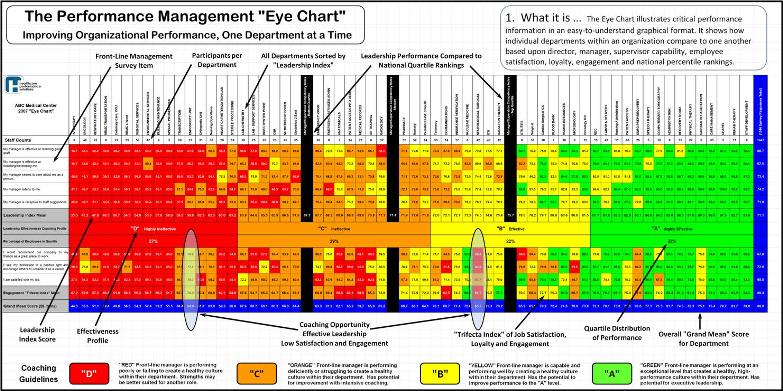
The Performance Management Eye Chart is created using data from your existing employee satisfaction survey. Quite simply, we convert the employee feedback into a bottom up multi-rater, leadership assessment. The Eye Chart is a large-scale visual tool that compares leadership performance and cultural engagement at a glance. You can instantly view departments that have healthy mini-cultures of excellence (here represented in the Green and Yellow quartiles) and those that are struggling or failing (in the Orange and Red quartiles). Furthermore, the Eye Chart illustrates how front-line leaders compare to one another in your organization, and how they compare to their peers nationally. The colors, ranking and relative position of each department presents both synthesis and meaning. The Eye chart is the first step in identifying where you need to act and with what sense of urgency! By creating a more transparent and objective culture of performance, We essentially make the invisible visible.
To get the Performance Management Eye Chart Brochure (PDF) click here: Brochure
To view a Performance Management Eye Chart sample(PDF) click here: Eye Chart
Eye Chart Question and Answers (Video Clips)
Request a Customized Webinar or Phone Presentation - Request a Proposal - About Us - Home Page
Copyright (c) RPR2 and Success Profiles, Inc - All Rights Reserved

PERFORMANCE EYE CHART ::